Launched StepUp, a retro-style steps counter app
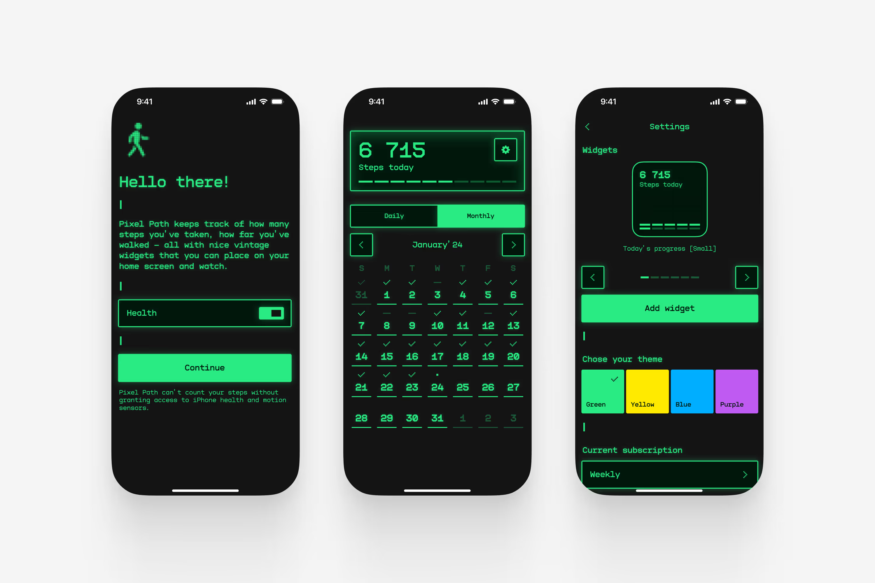
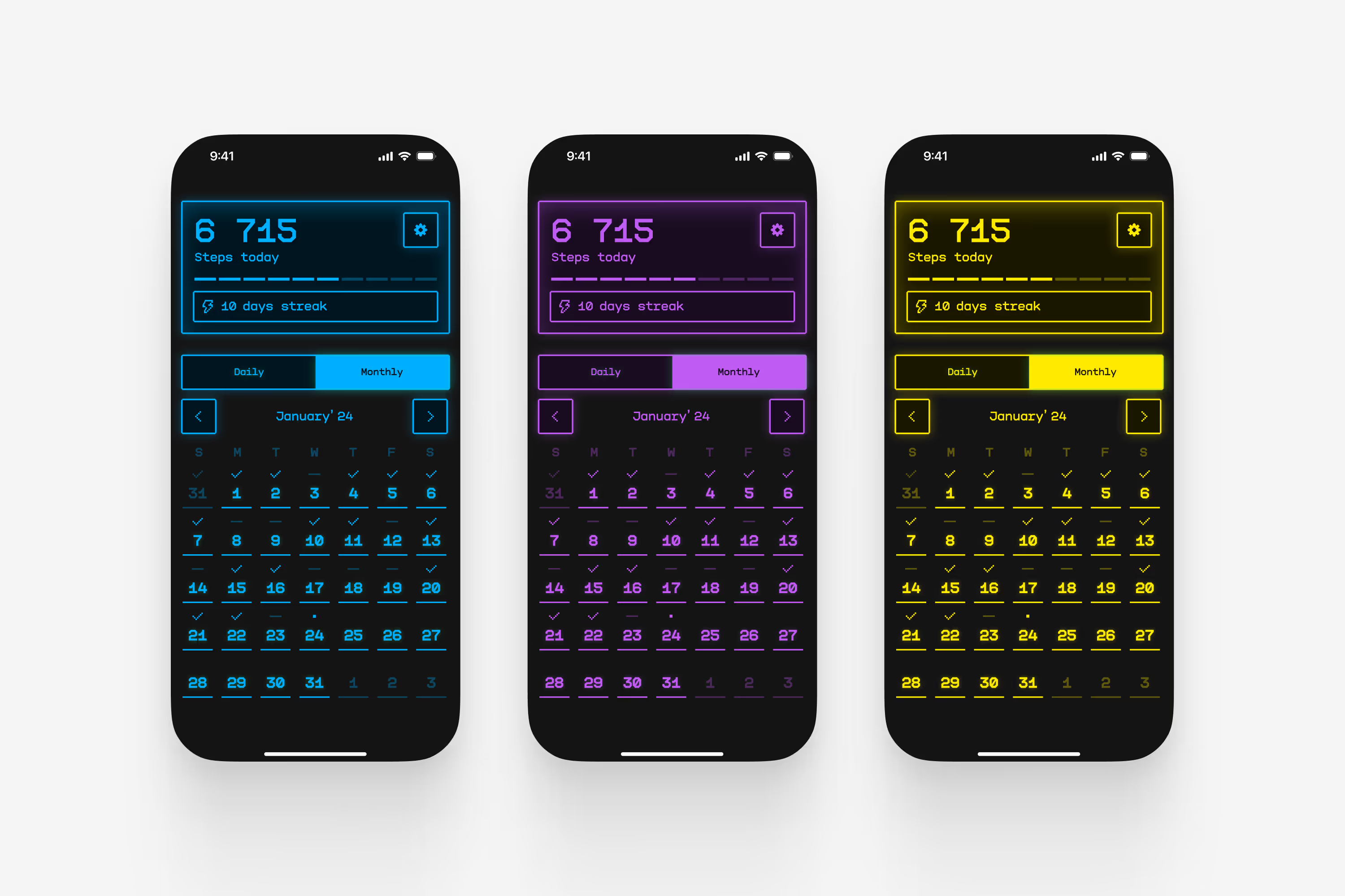
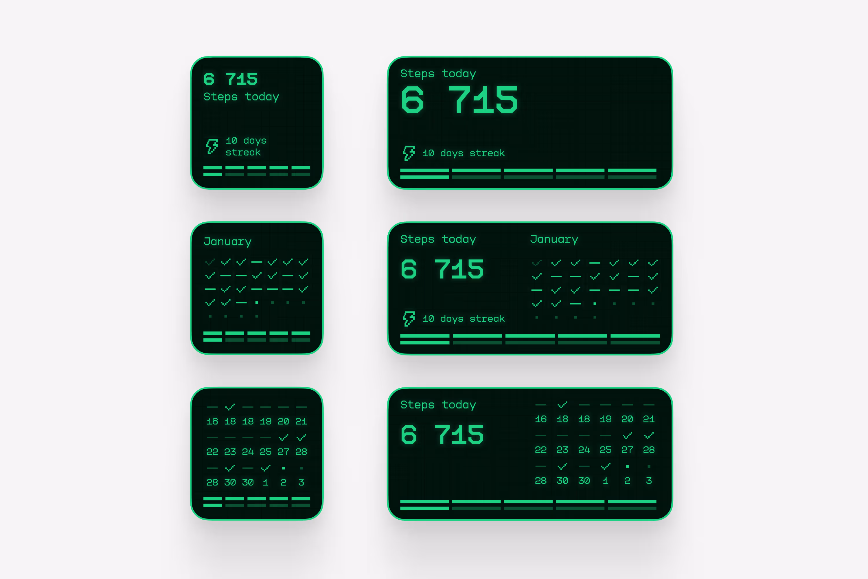
I turned a plain step counter into a retro arcade experience with pixel fonts, neon glow, and social apps that unlock only after the daily goal. Working solo with one engineer, I designed UI, lively widgets, and paid themes that fund the project.
#4 Product of the Day
+500K
4.9 ★